Hello, World!
Table of Contents
I finally got around to creating this blog! It took me longer than I thought it would, even considering the parenting, house-spousing, depression, and curve balls in life.
Landing page#
The landing page for the website was ready around the beginning of July. The pixel art was initially actual images enlarged with image-rendering: pixelated and image-rendering: crisp-edges, which meant the HTML was smaller and cleaner, however, the sword hilt and tip had alignment issues with the navbar blade. My CSS-fu was too weak to fix it. Toward the end of the month I re-created the images with CSS Flex and one div per pixel. It made the HTML way longer, but there are no alignment issues, and I like it much better this way.
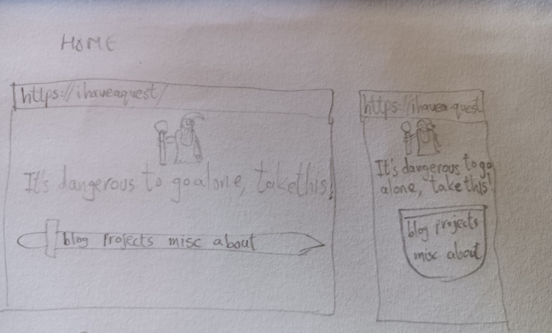
Here are the images I drew to plan my landing page:

The mobile view was initially supposed to change the sword to a shield to fit in however many nav elements I would have to add. I’ll probably do that in the future, since they seem to fit in the sword in all my tests so far.
Blog page#
I spent a very long time looking at various blogs to find a design that I might like. It didn’t happen. My brain wasn’t cooperating with an original design either, so I did what I do whenever something like this happens. I looked at some tutorials to get eleventy set up, created some sample blog posts with different markdown elements, then got around to styling it by trial-and-error. Eventually, I ended up with something that I felt was good enough to publish. If you’re reading this post in September 2022, you’re probably seeing one of its first published iterations. It will definitely change over time as I get feedback about it, and I’m super excited about it!
Future plans#
As of this moment, only the landing page and the blog page are implemented. The projects, miscellaneous, and about pages are next in line, and should be done by the end of the month!

